Photo credit Merry Christmas and Happy Holidays!
Month: December 2011
Art of Skyrim
Posted in Other Artist Work
If you have a video game playing male over the age of 17 in your house, chances are he's playing Skyrim. The game came out this past November and is a big hit. One of my sons noted how artistic the game is. I sat down to watch and he is right – the artwork of the game is beautiful! The landscapes are gorgeous, dragons have detailed scales and reptile skin, the boulders look real, the lighting is wonderful, the carvings on doors and the little details on the buildings are really something to behold. I don't typically think about the artwork that goes into creating a video game. And yet, these artists are such an integral part of video game creation. Take a look:
Gameinformer.com has a great article about the artists behind the game Skyrim.
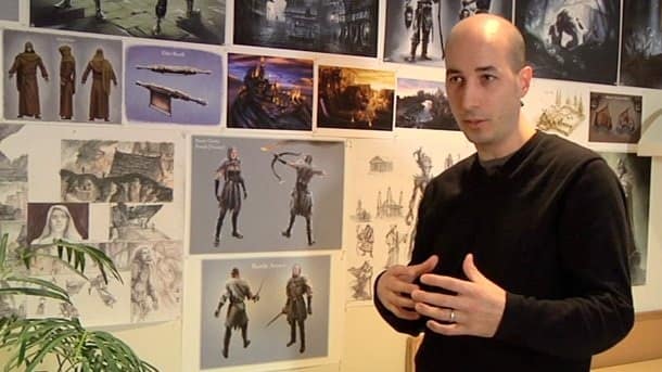
Meet Matt Carofano, the Art Director on Skyrim from Bethesda Softworks. Included in this article is a video how this talented team of artists bring the land of Skyrim to life. At 3:10 in the video one of the digital artists is using a digital pen to detail an image on the computer, which is interesting to watch.
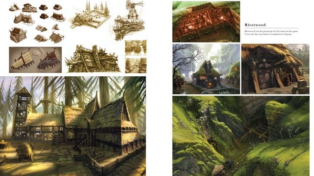
Kotaku.com has some great shots of the conceptual art before it goes to the level designers who create the actual gaming actions.
The lighting in the first photos is fantastic. The detailing of the arm muscles and chain mail in the second photo is some of the attention to detail of the artwork in this game.
Escapist magazine details what influenced the artists and the direction of the artwork:
"Living by the mantra of "less Renn-fest and more biker bar," they pulled heavily from McFarlane's work, dark fantasy art, and Bethesda film favorites, The Lord of the Rings trilogy, without giving in to the temptation of ripping them off entirely. In the end, 90% of the work was thrown in the trash, leaving only the best ideas to provide a visual blueprint for Skyrim.
As with all conceptual art, it was eventually handed to the level designers to create the physical, interactive world. Of course, not everything translates precisely from those first ideas, but without such a vibrant foundation, the programmers would never have been able to hem such a large, consistent world together so seamlessly. "There is so much more than what we drew that's just so amazing. It's like Christmas," said artist Adds Lederer. "It's so cool to see all of that stuff come together, and what's really amazing is just how much further they take it, and how much cooler it is." – Escapist magazine
And that's a peak behind the video game easels. The bloggers at Kotaku.com are devoted to showcasing the fine art of the video game artists. Stop by their blog to see more about these fantastic artists.
New Teddy Bear Painting
Posted in Art Work, and Peeking Behind the Easel
Here's my newest painting: "Teddy Bears Three"
I started this one several months ago and got stuck on the teddy bear fur. I've written about getting stuck on a painting in previous posts. In this case, I knew what the problem was but it was going to need serious concentration to move it forward. I pulled it out after joining StitchSilly in her pledge to build up shop inventory by add one thing a week for 8 weeks.
I used my daughter's old stuffed animal collection for the initial composition. I liked how the well loved toys no longer sit up straight – they lean against each other to stay up. I used an Ampersand gesso art board for this painting. The art board has a very smooth surface and handles lots of light layers of paint well. Painting teddy bear fur requires light layers of gradating paint colors, lightly tapped (stippled) on to create the soft fluffy look of the fur. I started with mid tone brown and slowly added burnt umber ( dark brown) to the mix as I stippled on the fur. Then I use the first mid tone brown and begin adding a little yellow, and then white to create the lighter fur. When layering 15 -25 layers of paint, it's pretty easy to end up with a muddy look – which is what happened on the first round. This week, I slowly reworked the stippling, painted on the bows and faces. Now I think it looks like fluffy teddy bear fur. : )
That's a peek behind my easel! Thanks for stopping by!
I have paintings year round at the local art association's mall gallery. I've been asked several times about this gallery. So I thought I would take you on a tour – let me introduce you to the Chester County Art Association's Exton Square Studio.
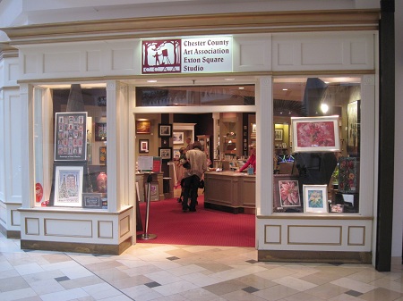
This is a a satellite facility located in the Exton Square Mall. It reaches a lot of people that would not normally venture into an art gallery.
.jpg)
It doesn't take long to become an art lover with all the great art to be found inside.
.jpg)
What makes this gallery fun is it has artists of all levels – famous professionals to up and coming new artists. There are artists who create gorgeous watercolor, oil, pastels, mosaics, pottery, jewelry, blown glass, graphite, pysanky eggs, furniture makers, woodworkers, sculptures, photography, and more.
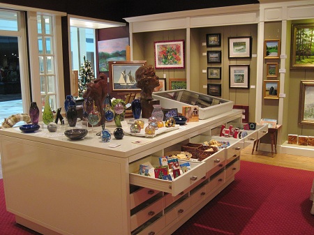
There is still furniture left from a former store and the wonderful staff puts everything to use for displaying artwork.
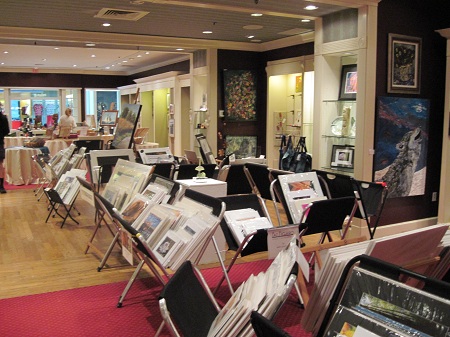
There is a huge amount of artist's portfolios filled with photography, paintings and drawings to choose from as well. Behind me in this photo is the very large room where the almost free art classes are held for adults and children. Thousands of children enjoy art classes with professional artists every year here at the gallery. I think it's a great way to expose children to art as they walk through the gallery to the art classes. All housed in the convenience of the local Mall. Hope you enjoyed the tour!
It’s Not Your Imagination
Posted in Organization
It's not your imagination……..yup, you're not going crazy….. I have changed up my blog "clothing" again. Seriously, it 's like a "running-late-morning-can't-decide-what-to-wear" clothing crisis. I had too many choices on blog themes and bells and whistles. I think I finally found a good compromise on inside bells and whistles and outward appearance. There may be some tweaking over the next weeks but I think you can now rest assure that the blog will not suddenly completely change while you are visiting. : )

We're good to go now – all cleaned up from our construction ! Hat tip to Mike at Pinterest. Photo credit: Daily Mail

