Skip to content

Category: Art Work

Chickadee Miniature Painting

Posted in Art Work

Chickadee Miniature Painting

I have a new miniature painting up on my Etsy shop.

Black Capped Chickadee in the snow

Isn't he cute? We have Black Capped Chickadees year round. However, we really don't see much of them until winter comes. The bare branches of the trees makes it easy to see them when they are hanging out.  I think they like the snow or maybe they just like that we tend to feed them more in the snow!  I painted this little guy sitting happily in the snow – probably waiting for the feeder to be refilled. : )

Solving A Painting That Is Not Working, Part 2

Posted in Art Work, and Peeking Behind the Easel

Solving A Painting That Is Not Working, Part 2

 I suggested several steps yesterday to take when you can't figure out why a painting isn't working. For this painting, even turning it upside down wasn't getting me to what the problem was.  So luckily for me, my family was here. Family – especially teens and young 20's will tell you the truth – even when you didn't ask them.   : )

My family was curious how I could  fix the imbalance after they noticed the problem.  Since they were interested I got them involved in step 1 – brainstorm how to fix it.   With my chalk – step 2 – I sketched out on the painted canvas our ideas. [ Chalk is great  – it doesn't disturb the painting and wipes right off. ]    We tried adding more sunflowers, more details on the pumpkins, pumpkin leaves and vines from the stems, until someone blurted out turning it into a jack- 0-lantern.  Whoa!….. that was not at all what I had been thinking. 

But you know what?  It worked. It balanced the painting and added a light note to the painting to match the color palette I had chosen.  Here's the chalked idea:

Using chalk to try out details on a painting

And here's the final painting after also adding a final tint on the pumpkins and photographing in natural light:

I had envisioned an Indian summer day for this painting, picking a light palette of colors rather than the usual darker colors used in pumpkin paintings. Adding a face to the pumpkin kept a lightness in the painting in addition to balancing out a composition error.  In a roundabout way, that's where the painting ended up – a warm, Indian summer day in early October.

What do you think?


Solving A Painting That Is Not Working

Posted in Art Work, and Peeking Behind the Easel

Solving A Painting That Is Not Working

It happens to all of us. You're happily working on a painting and as you think you are finished, you can see something is not right. Sometimes it's obvious like the colors are clashing, or the proportions are wrong.  Other times……you just can't see where the problem is but you know it's there.  What to do?  Here's some suggestions I use:

– move the painting to another room for fresh perspective

– turn it upside down.  You'd be amazed at how this simple trick helps your eye see the painting differently

 – put it away for a few days and look at it with fresh eyes.

 – show it to another artist  – they can usually see where the problem lies.

– ask your family members – they never hold back the truth and they look at it differently since they are not artists

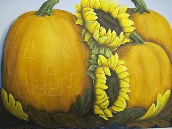
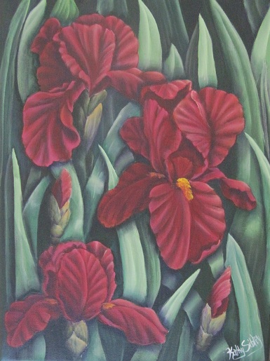
Here is my current painting that is having issues:

When a painting isn't working - sibstudio.com

Can you see what isn't working?

My family noticed right away that the painting was lopsided.  Non artist words but right on target.  If you mentally divide the painting in 1/2 – the right half has sunflowers and pumpkins, the left half – it's one pumpkin. A composition boo boo that I missed way back in the sketching out of the painting.

How to fix this?  

Step one – brainstorm how to balance the painting, 

Step two – get a piece of everyday chalk and start sketching out right on the painting what changes might work.

Stay tuned tomorrow to see what we came up with! 
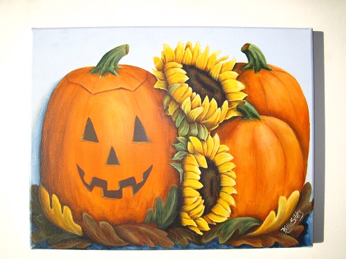


Painting Dew Drops

Posted in Art Work, and Peeking Behind the Easel

Painting Dew Drops

After posting on dew drops this week, I was curious about how to paint them. It's not something I've painted before. Over the years, I've saved "how to" pages from various art magazines. I keep them in clear page holders in a  loose leaf notebook.  It comes in handy as a great reference for times like this.

Turns out that I have saved instructions from several artists on how they paint dew drops. All of them have the same basics: transparent wash of light  yellow to form the drop, darker shade of the leaf or flower for the shadow in the drop and the cast shadow, and a highlight on the dark shadow of the drop.  Highlighting over the shadow of the drop was the part that was most interesting to me. Usually the light side is highlighted, instead the shadow side is to create the appearance of translucency.  Here's my first try:

1st try at painting dew drops

I used a scrap of watercolor paper leftover from trimming a painting. The middle leaf is based too dark to give a good effect but I was pleased with the left and right leaves for my first attempt. I am inspired by fooling around with painting dew drops. I'll be working on a painting this week including dew drops. Stay tuned.  

Iris Painting Finished

Posted in Art Work, and Peeking Behind the Easel

Iris Painting Finished

It's finally finished! In a perfect world I'd paint from start to finish in a few days. That rarely happens when juggling  family commitments and I think it works in a weird way.  It's easy to be too critical when you are working up close on a painting.  A number of small break  between painting helps me see it with fresh eyes.  Things I thought were awful turn out to be just fine and having time to mull over the step helps move things along  when I pick up my paint brush.

I surprised a lot of you, my dear readers, with my choice of red for the irises. I have pushed the red to more of a maroon and I think you will love how it turned out.  I dug out an old hard copy photo of a maroon iris that at one time grew in my yard. I used this photo as a guide for the highlight and shadow colors.  If you look closely, you can see the shadows are a deep purple and the highlights in the sun show fuschia, oranges, and a little yellow.  Here's the scanned photo:

And finally – here's the finished painting!

I am pleased with the finished painting. You'll will be able to find this on my Etsy shop over the weekend. Hope you enjoyed following along with this painting and the peek behind my easel!

If you missed the beginning of the painting -links to follow along with the painting:

http://www.sibstudio.com/starting-a-new-painting

http://www.sibstudio.com/iris-painting-update