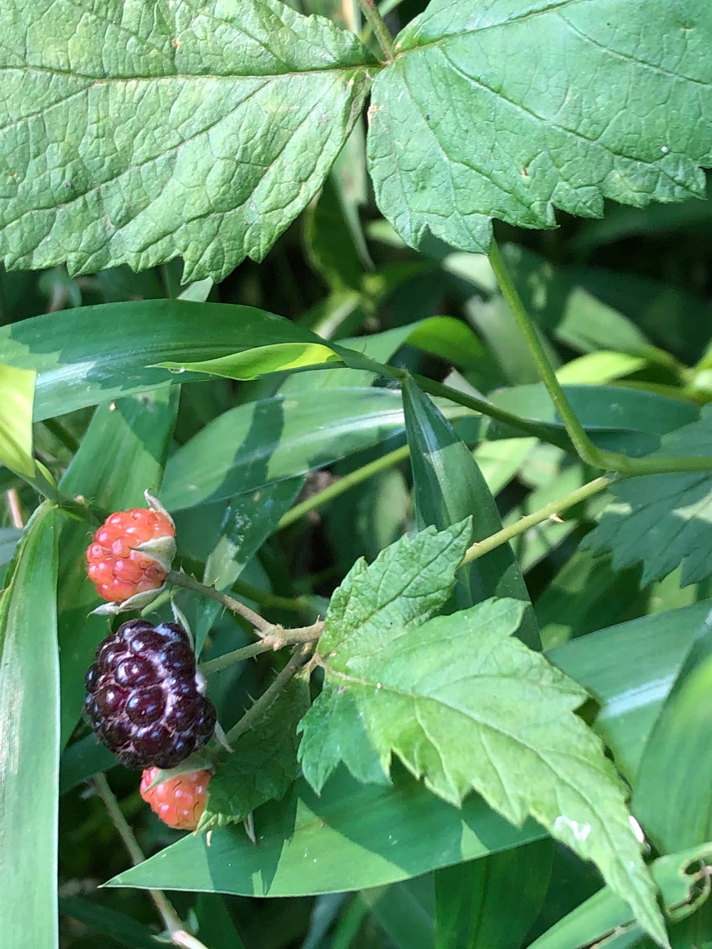
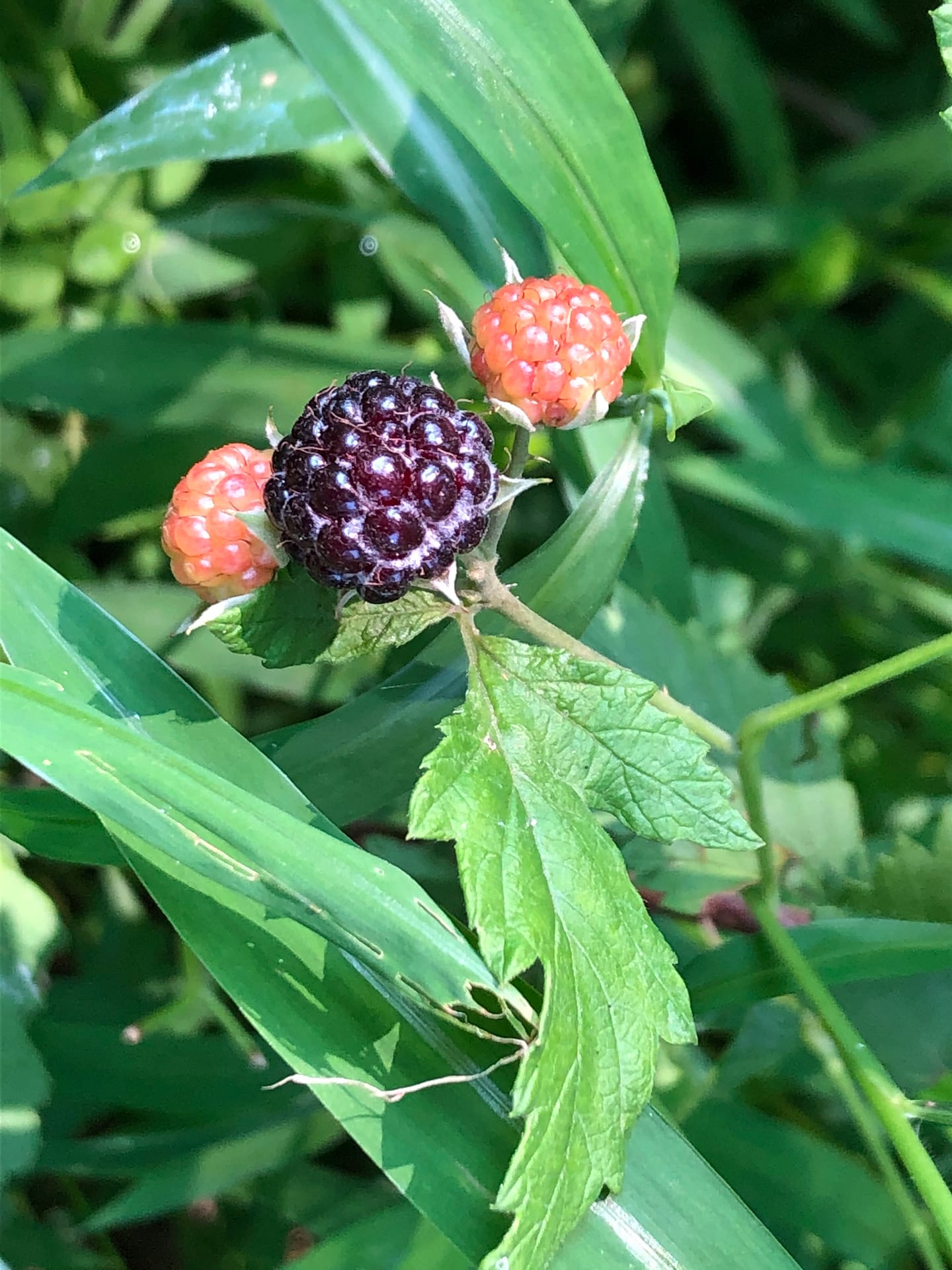
We have thorny raspberries bushes popping up all along the edges of the walkways in the neighborhood. I got a few photos before the birds noticed them too.
I am guessing that these are black raspberries since several managed to turn black before the birds got to them.
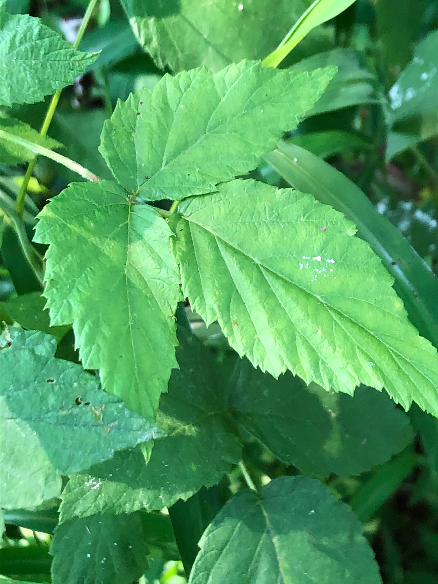
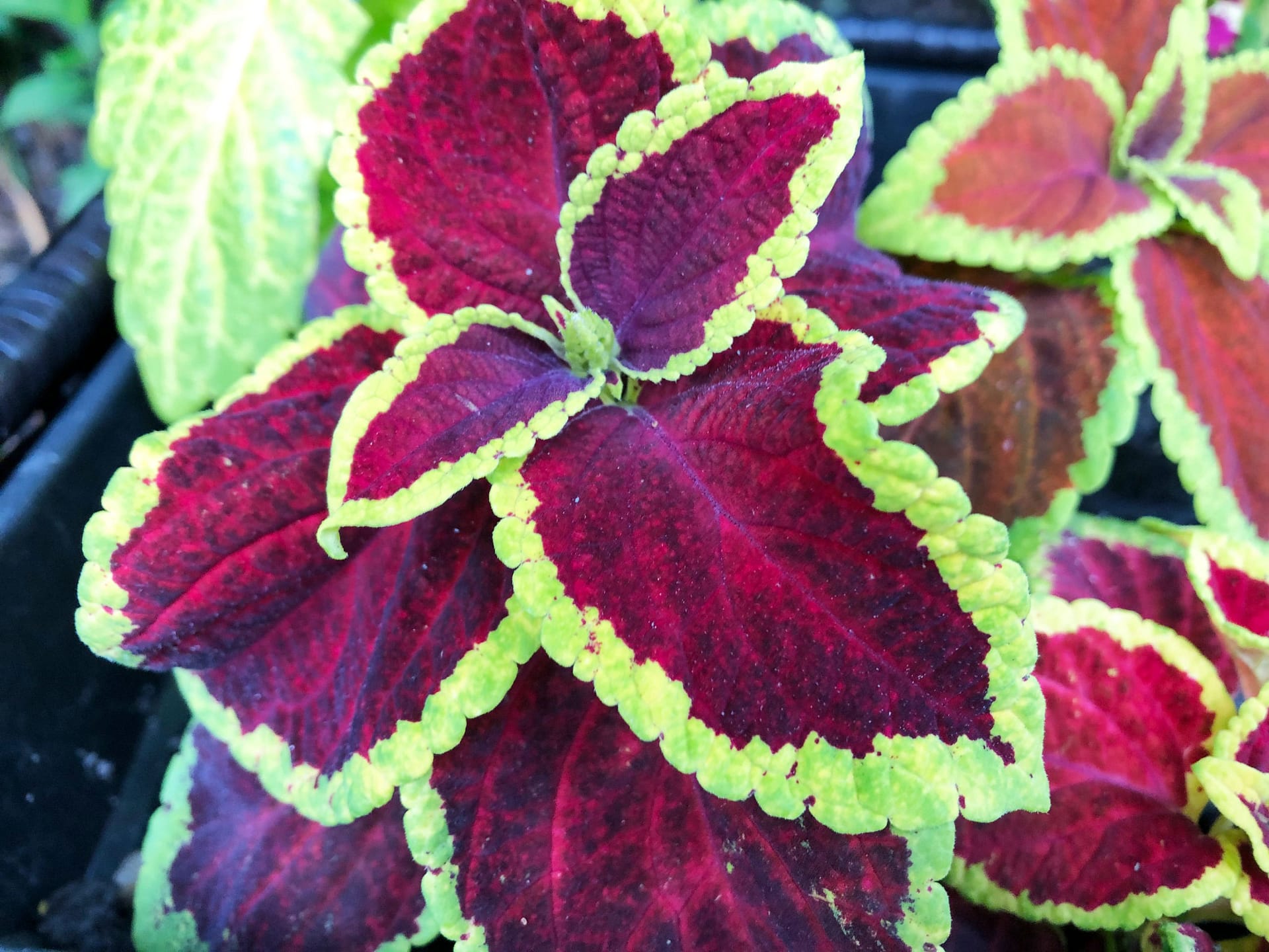
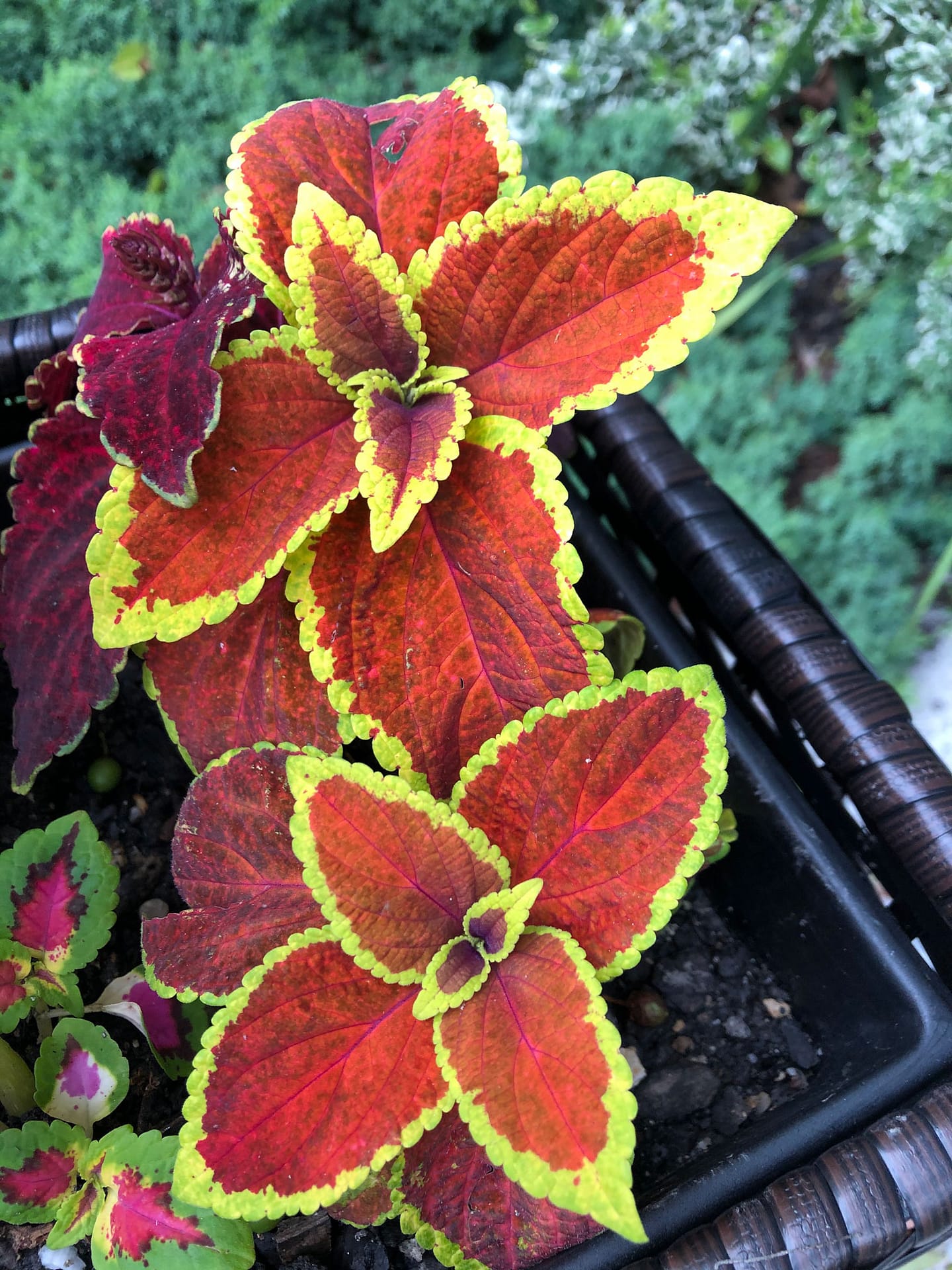
When taking reference photos of plants or flowers, I try to get a photo of the leaves as well. These beautiful raspberries may show up in future paintings.
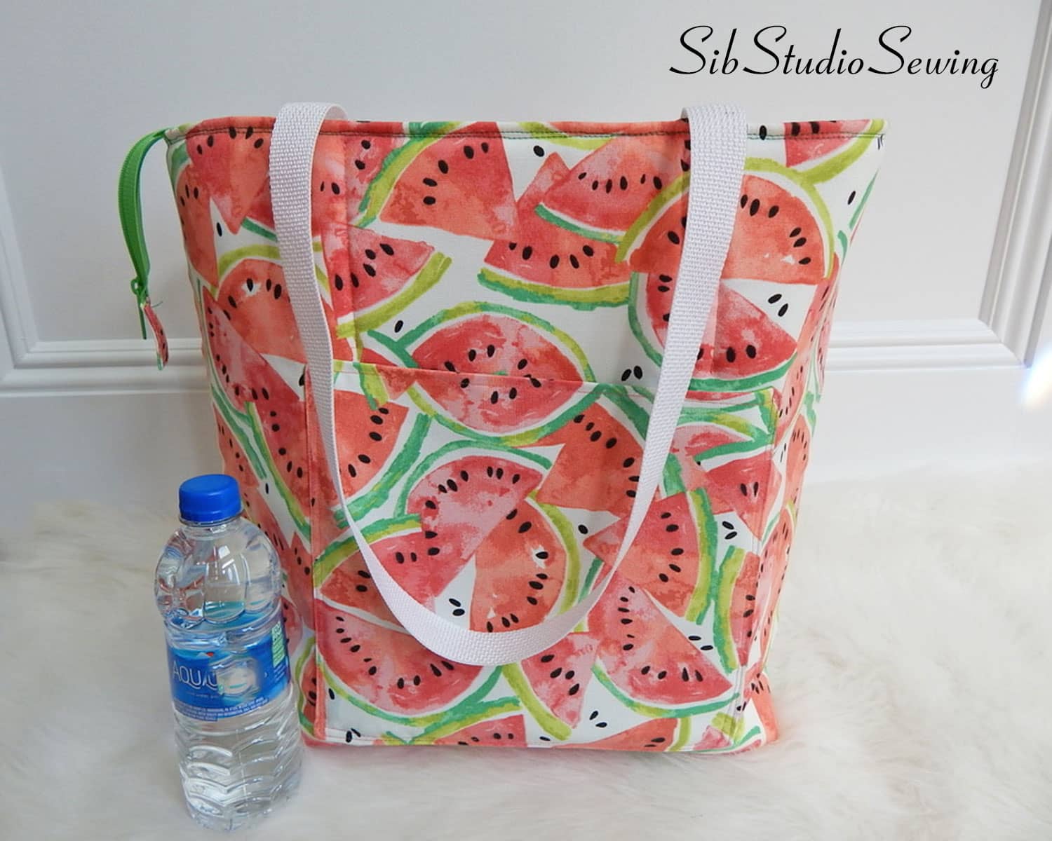
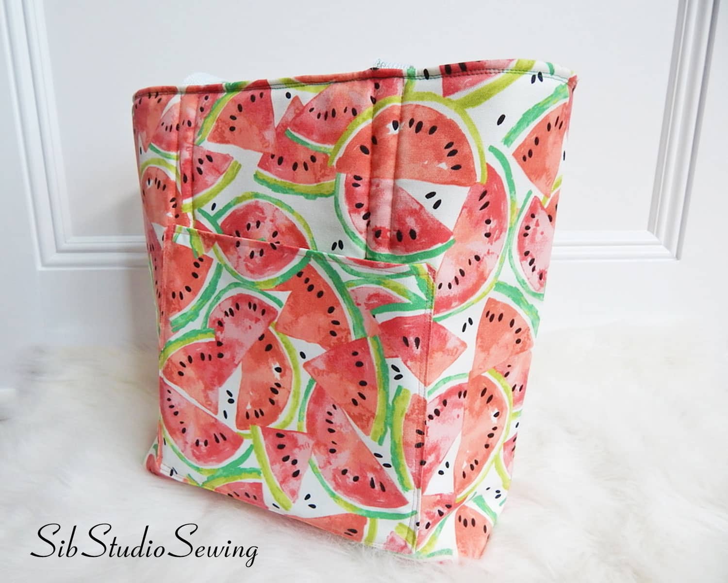
I just listed this beauty on my Etsy shopyesterday evening. Bright and cheerful watermelon slices makes for the perfect summer tote bag. Big and roomy to fit all your needs: 14 x 15 x 6.25 inches.
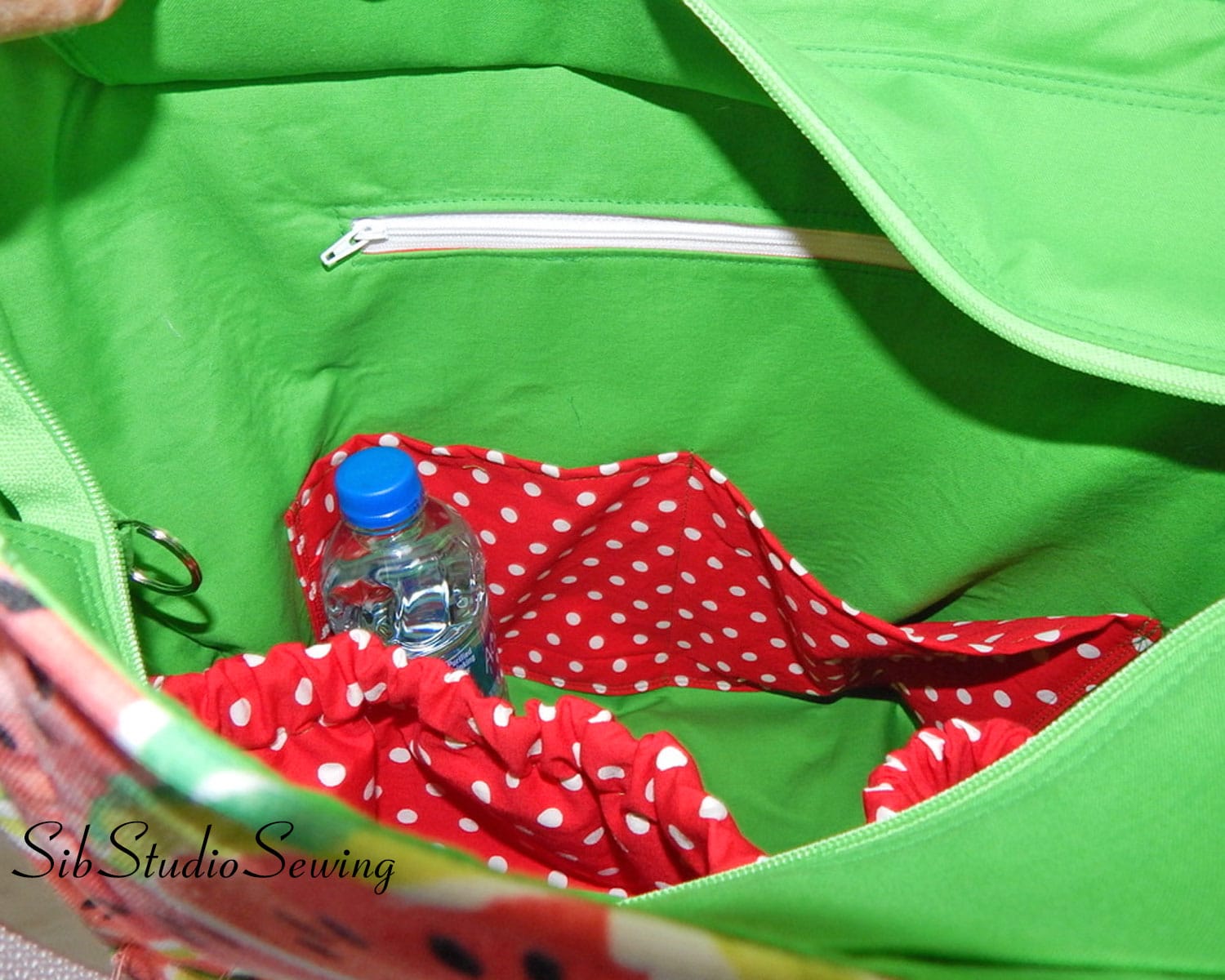
I always add lots of pockets to my tote bags so they are really practical as well as fun. This bag had 2 large outer pockets and 5 more inside.
There is a zipper panel closure so you can close of the bag as well as leave it opened up wide, depending on your needs.
I really like the fabric – so pretty and summery, yet nice and sturdy for actual use.
You can find this cheery bright large watermelon tote bag at my shop: SibStudioSewingon Etsy
I’ve been continuing to experiment with sizes and features of my crossbody tote bag. I am always tweaking and changing a design based on customer’s suggestions, buyer’s custom orders, what I see women carrying while people watching, or sometimes just looking at a fabric can give me an idea.
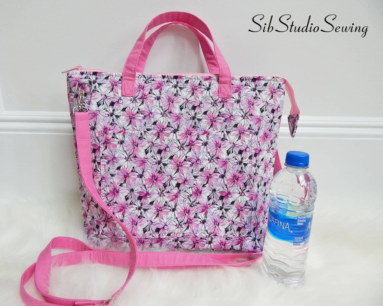
I have a new crossbody tote bag listed on my SibStudioSewing Etsy shop. This new one has some new bells & whistles.
This size is similar to my other bags, 14 x 11 inches. and has the adjustable crossbody strap and as well as easy to carry handles. There are always lots of pockets inside & outside for practical, everyday use. A zipper closure is a must for most of my customers.
I added the pretty feature of the zipper cover on the front zipper pocket. I saw that on another bag and thought that was such a nice feature to give the bag a clean finished look.
I also added pretty sewn in fabric tabs for holding the rings for the strap. It also gives the bag a more polished look.
This bag has feet at the bottom of the bag to keep it off the ground when you set it down. I often use faux leather so the bag can be kept clean even when it is set down. But, sometimes, I like the look of a fabric bag and the feet are a great addition to help keep the fabric clean.
Feel free to check out the new crossbody bag on my Etsy sewing shop: SibStudioSewing.
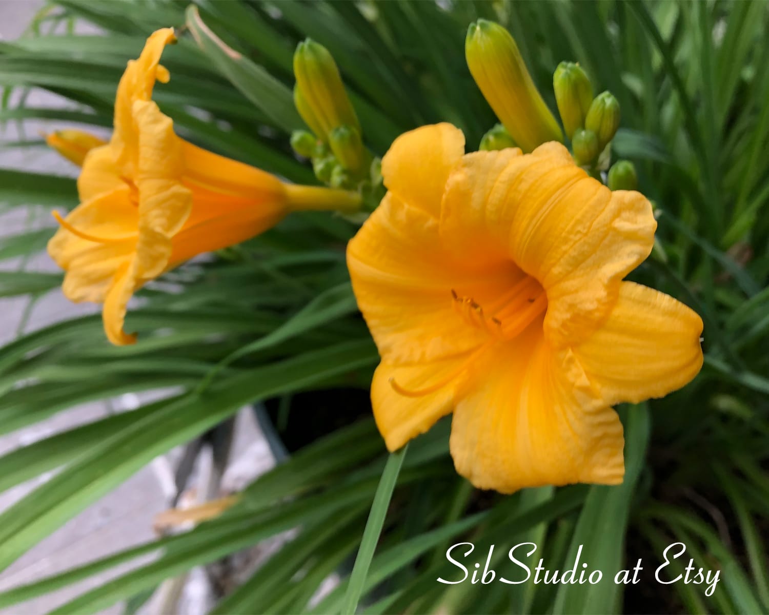
Lilies are pretty reliable perennial flowers, but the Stella D’ora is a trooper. They came up year after year, not matter where they are planted. These beauties are up and blooming all around my yard right now.
I love their yellow blooms and their bright green leaves. I often take reference photos of these lilies for future drawings & paintings. Enjoy!