Skip to content

Tag: pantone

Pantone Color of the Year 2019

Posted in Peeking Behind the Easel, and Peeking Behind the Seam

Pantone Color of the Year 2019 Living Coral & Steve
https://www.pantone.com/color-intelligence/color-of-the-year/color-of-the-year-2019

The newest Pantone color of the year for 2019 was announced a few days ago.  

“Vibrant, yet mellow PANTONE 16-1546 Living Coral embraces us with warmth and nourishment to provide comfort and buoyancy in our continually shifting environment…..Symbolizing our innate need for optimism and joyful pursuits, PANTONE 16-1546 Living Coral embodies our desire for playful expression.”

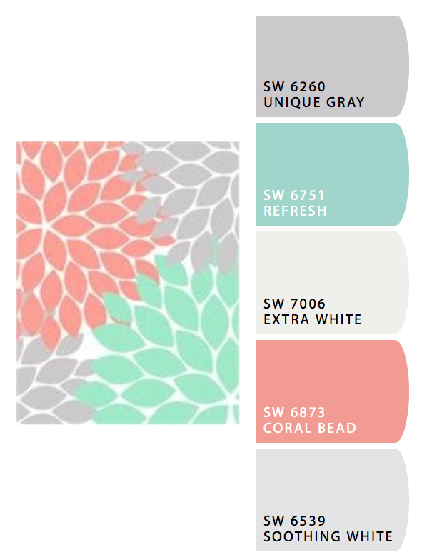
Coral is a classic match with grays, crisp whites, aqua, turquoise blues and sage greens. I like that coral can be soothing or bright and crisp depending on what other colors it is paired with. 

Coral is a natural match with turquoise  for a summer palette .

Sherwin Williams blends coral with grays, whites, and sage or turquoise green.

I like this coral color.  Expect to see it in spring and summer clothing,  and home accessories.  I will be including it in paintings and sewn accessories this year. 🙂


Pantone 2018 Color of the Year

Posted in Reviews

Yesterday Pantone released their color of the year for 2018 :

18-3838 ULTRA VIOLET

I get a kick out of their artist statement on the meaning of the color Ultra Violet:

“A dramatically provocative and thoughtful purple shade, PANTONE 18-3838 Ultra Violet communicates originality, ingenuity, and visionary thinking that points us toward the future…

…..Nuanced and full of emotion, the depth of PANTONE 18-3838 Ultra Violet symbolizes experimentation and non-conformity, spurring individuals to imagine their unique mark on the world, and push boundaries through creative outlets….”  

As an artist, I like the medium tone and that is not a harsh, jarring color.  As a seamstress, I know my customers who go crazy over purple, will love anything made with this Ultra Violet.

I like this color. It’s a nice calm, shade of blue-purple that is not too harsh or too pastel. It would be a nice accent in any home, whether in a painting, on a wall, as pillows, or furniture.  It’s a color that looks good on most people as far as clothing goes.  There are so many people who love purple, I think Ultra Violet will be a big hit.

SaveSave